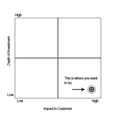
If you are like myself and most people today, you go to Google to find the answers to every question. Well, when I started learning how to increase conversion rates on websites that I work on I found a ton of blog posts and articles that all pretty much said the same thing.
And now after years of actually working on it I’m here to offer my version. But I have to warn you now, there is no formula that you can plug in to any site to make it work. The only way to increase conversion rates is to intensely understand your markets needs and effectively communicate solutions while offering a clear path to the answer.
You can test all the landing page designs you want, use captivating images and videos, make the call-to-action button bigger etc etc. But if you are not saying the right thing it’s all for not, or another way to say it is “it don’t mean a thing, if it ain’t got that swing”.
- Talk to your market. If you think you know your market, think again. Really, I don’t care how smart you are, as interesting as your opinion might be, it’s irrelevant. I’m not saying you aren’t 100% correct but you just don’t know until you’ve spoken to hundreds of representatives of your target market segment. Ask them what their problems are and just keep on digging.
- Measure the intensity of the problems you discover. You don’t want to offer solutions to something that doesn’t feel like it’s a hair-on-fire issue. For example, if someone’s hair is on fire and you offer them a bucket of water, they are going to take it. And if you are brazen enough to ask for cash in exchange you will get it and quickly. Use the chart at the top of the post as a way to measure the depth of pain being experienced as a result of these problems.
- Group the problems together. After digging for long enough you will inevitably create a long list of real problems but you will also find that many of them seem to be similar. Now you group them into categories and start thinking about features that will solve the whole group. The best example of this is “bumper-to-bumper warrantee”. There are many real painful issues solved by that one feature but when you are communicating it you don’t want to get specific. You want your features to sell your product like “bumper-to-bumper” sells new car leases. And sell them it does.
Once you have complete these steps you are ready to market your new product. For a stellar example of this check out this feature page for Evernote Business. Each feature title is not specific, rather they effectively describe a set of features that solve a set of problems. When the right person views them they automatically start to salivate. I know because I’m one of them.
This form of communication is called marketecture which is a combination of market and architecture. The link takes you to a wikipedia page offering a more detailed definition but if you want to learn how to make them like a champ I suggest attending a Pragmatic Marketing training session.
I sincerely hope this helps you understand how to increase conversions on your website and sorry for not offering a how-to on ux design. I do believe in the power of good web design when it comes to conversions… It’s just not the place to start.


